/ 02 of 05
Read 4 min ·
Skim 1 min
Patient intake in four minutes
Median intake time fell from 11 to 4 minutes, and 91% of patients now arrive with the form done.
Role
Lead product designer
Team
1 PM, 4 engineers, 1 clinical lead, 1 researcher (part-time)
Timeline
5 months, Feb to Jun 2025
Platform
Web app, mobile first

Skim mode: key sentences, key images and the outcome only. (4 min)
Context
Clinica makes practice software for small clinics: physiotherapy, family medicine, dental. About 300 clinics across Canada use it, and each one sends new patients an intake form before the first visit. In 2025 I redesigned that form over five months. My team was a product manager, four engineers, a nurse who acted as clinical lead and a part-time researcher. The form was a web port of a paper document: fourteen screens, sixty-three fields and a Save button at the bottom of each.
Problem
Only 63% of new patients finished the form before their first appointment. The rest filled it in at the front desk on a clipboard, and the receptionist typed it in again, a median of six minutes per patient. In a ten-person physiotherapy clinic that is half a working day every week.
Patients needed a median of 11 minutes, more than a third never finished, and the front desk retyped the rest. Nobody was happy, including the clinicians, who walked into appointments holding a form they could not trust.
Research
I spent nine days in four clinics, watched forty patients fill in the form and interviewed six receptionists and three nurses. With permission I also sat in on appointments. Nurses spent about ninety seconds on the form, mostly checking allergies, and then asked the same questions out loud. Two things stood out.
People did not quit at long questions. They quit at questions they could not answer from memory. Medication names, policy numbers and the date of a surgery were where the form was abandoned, usually with the phone still in hand and the wallet in a bag in another room.
Clinicians needed four things before the visit, and the other 59 fields could wait. Those four were why you are coming, allergies, current medication and anything that has changed since last time. The remaining fields served billing, history and legal reasons, and almost all of them could be pre-filled or collected later.
I ask the same five things every time anyway. The form just gets in the way of the conversation.
Nurse practitioner, family clinic in Ottawa
Decisions
Ask in the order the clinician reads it
The database wanted demographics first. The nurse wanted the reason for the visit first. We rebuilt the form as four short steps: Why you’re coming, Your health, Insurance and ID, and Review. Four steps, ordered by what the clinician needs first. Branching cut what each person sees, so the median patient now answers 19 fields, not 63. Legal and billing fields did not vanish. Consent moved to the end of the visit, where it is signed on a tablet, and billing details are collected by the front desk only when a claim is made.
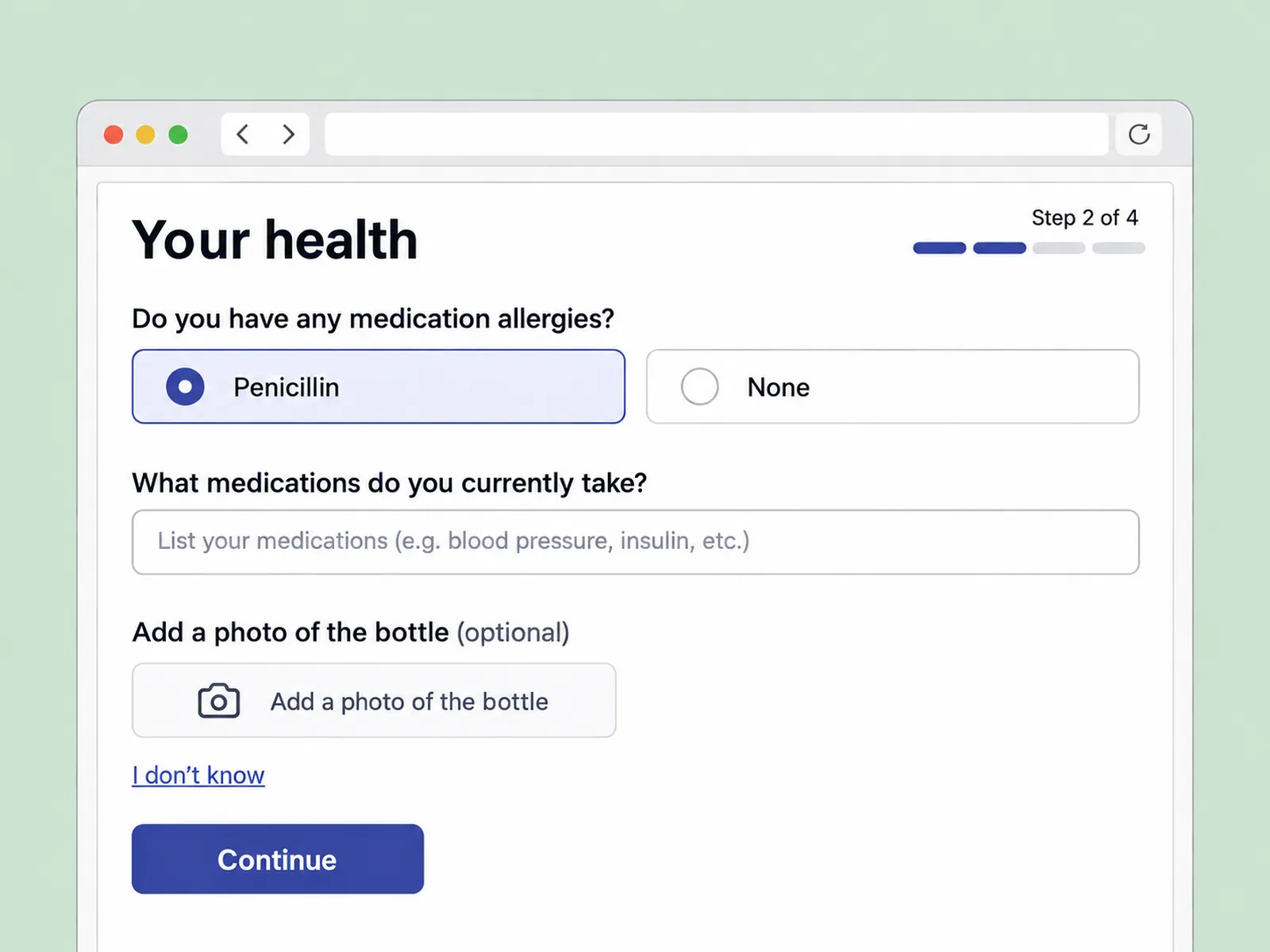

Drag to compare one intake page before and after: from a wall of fields to one clear step. Or focus the slider and use the arrow keys.
Let people say “I don’t know”
Every hard question now has a way out. Medication, insurance and ID accept a photo instead of typing. A pill bottle, a card, a referral letter. Staff read the photo at the desk. It looked like a cop-out in our first review and turned out to be the single biggest drop in abandonment: from 21% to 6% at the medication step.
What didn’t work: one question per screen
We prototyped a conversational flow that asked one question at a time. Patients loved it in testing and it took 40% longer. Nurses disliked it too, because they could no longer see the whole picture at a glance. We kept four short pages with a running summary instead.
A review screen for staff
Receptionists and nurses get one screen: answers on the left, flags on the right. Allergies, anticoagulants, pregnancy, anything the patient marked “not sure”. Staff review the flags, not the whole form. It was the smallest piece of work in the project and the one the clinicians mentioned first.
Outcome
11 → 4
min
median time to complete intake
91%
arrive with intake done, up from 63%
−6
min
front-desk retyping per new patient
Median completion time fell from 11 to 4 minutes, and 91% of patients arrive with the form done. Front-desk retyping disappeared, which gives a ten-person clinic back about four hours a week. Support calls about the form fell by half. We measured the eight weeks after rollout to 212 clinics, and the numbers held in both French and English.
Reflection
I tested with eleven patients over 65 late, in month four, and had to rework a date picker that was too clever. Next time they go in during week two. The decision I would repeat is to write down what the clinician needs first and let everything else wait. The French version was written by a translator, not by me, and it came back 30% longer. The layout had to flex, a reminder that a design is only a draft in one language. The next phase is the one I would have liked to start with: the form after the visit, which patients still receive as a PDF.